Rebranding a parenting app into a community movement.
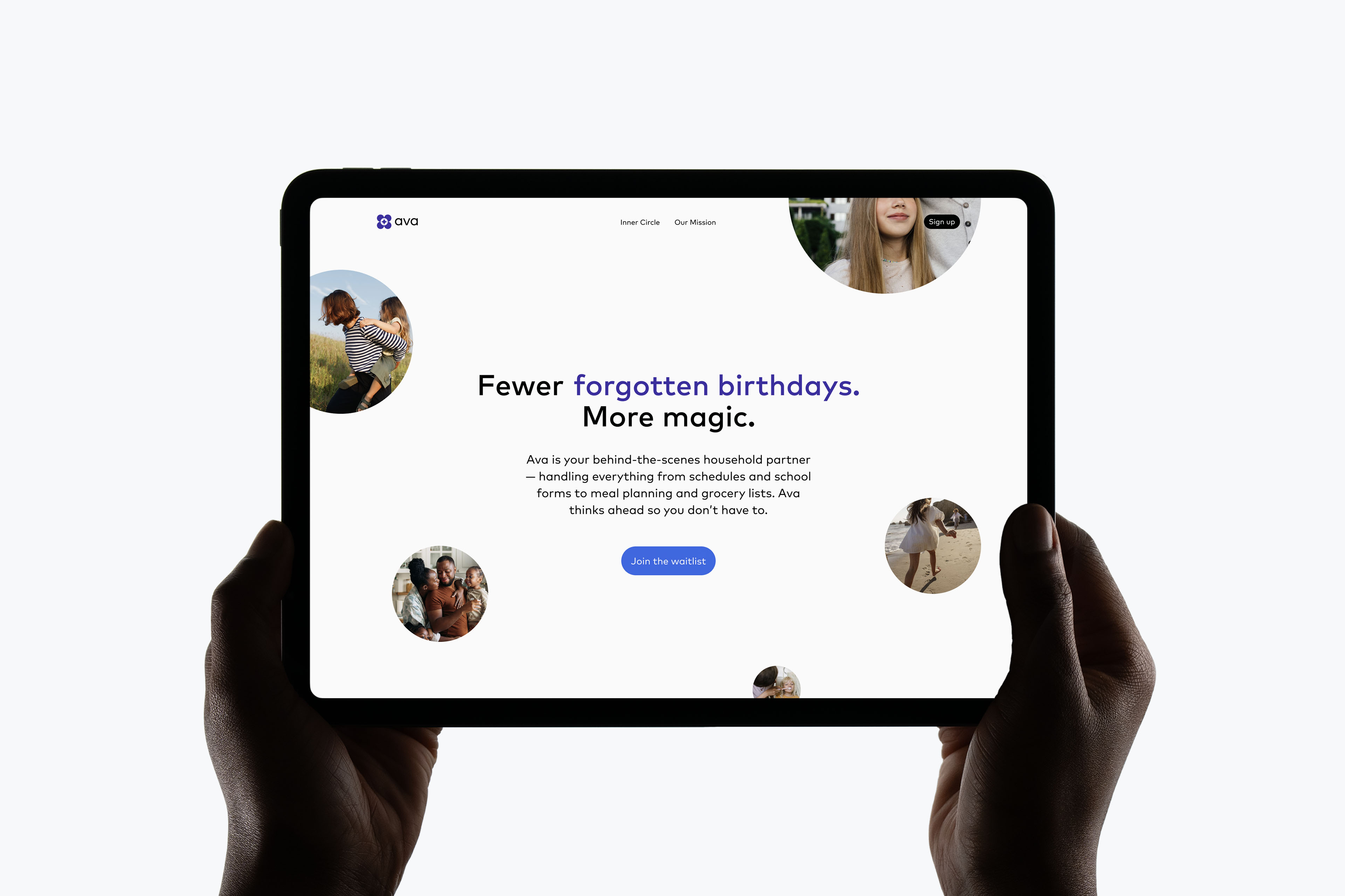
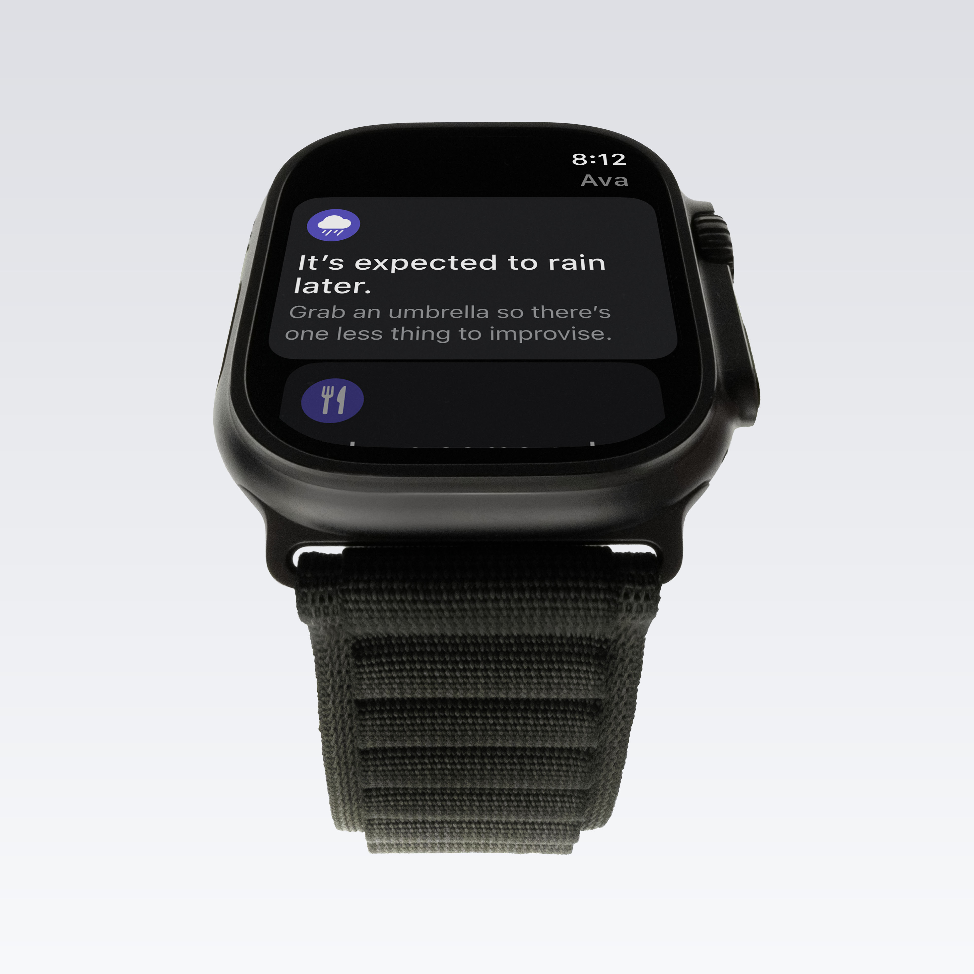
Ava is a technology company using agentic AI to lighten the mental load of modern parenthood. Designed as a behind-the-scenes household partner, the platform helps families manage everyday logistics — from school communication and scheduling to errands and planning. As the company prepared for its beta launch, the team needed a brand that could hold two things simultaneously: the intelligence of its technology and the warmth of the community forming around it.
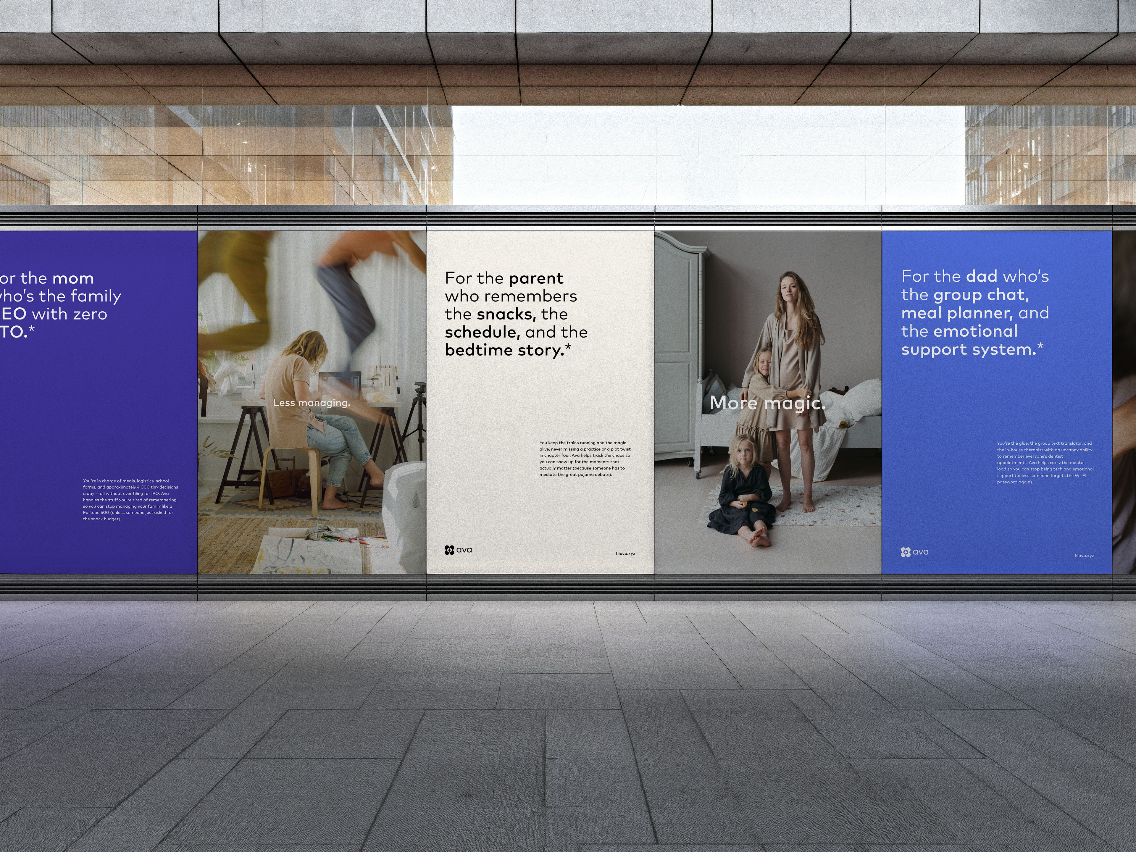
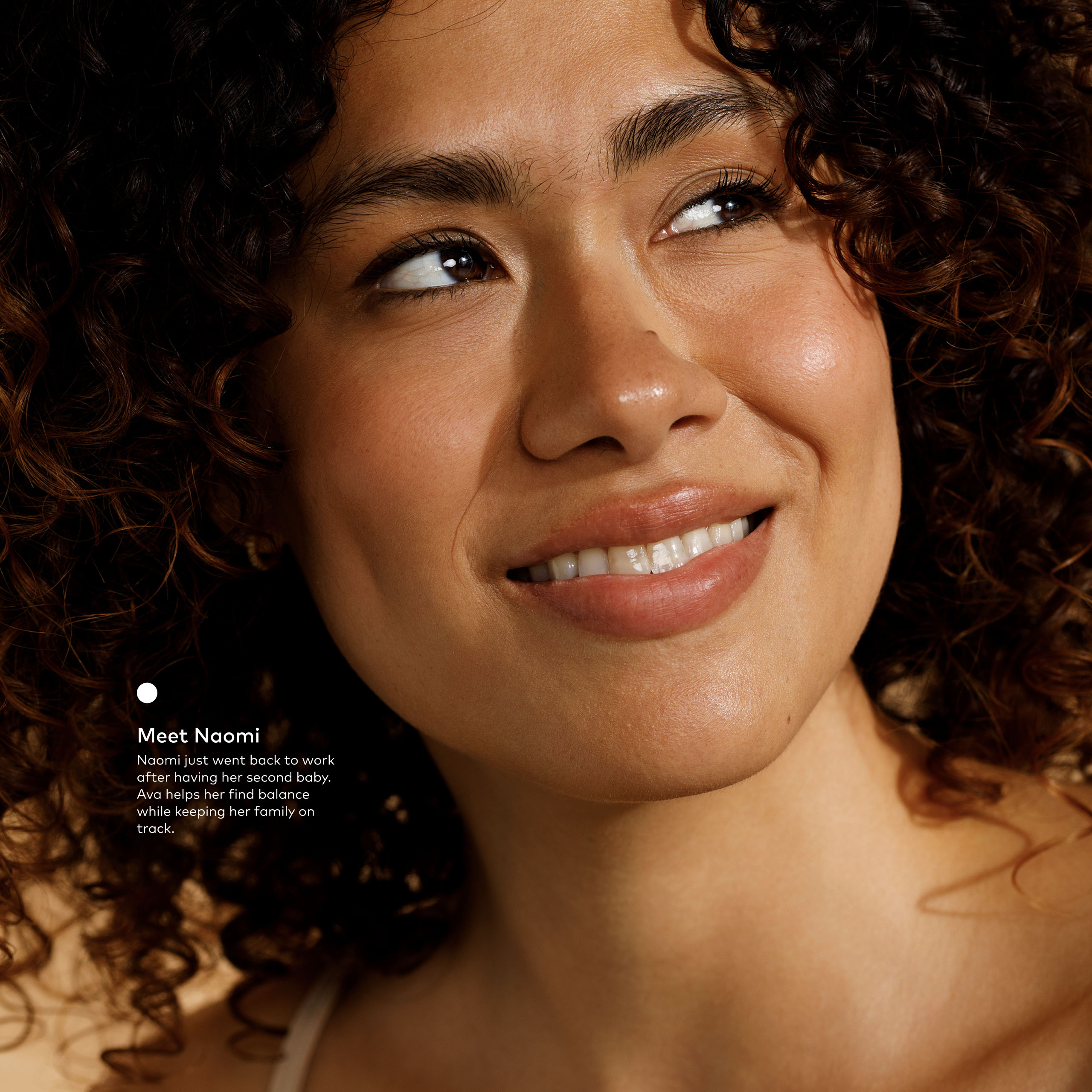
A key strategic insight shaped the work. Most brands targeting millennial parents position themselves as tools. Ava needed to be something more — a technology, community, and lifestyle brand that functions as a trusted partner rather than another app to manage. That shift in framing, from product to movement, became the guiding principle for the identity.
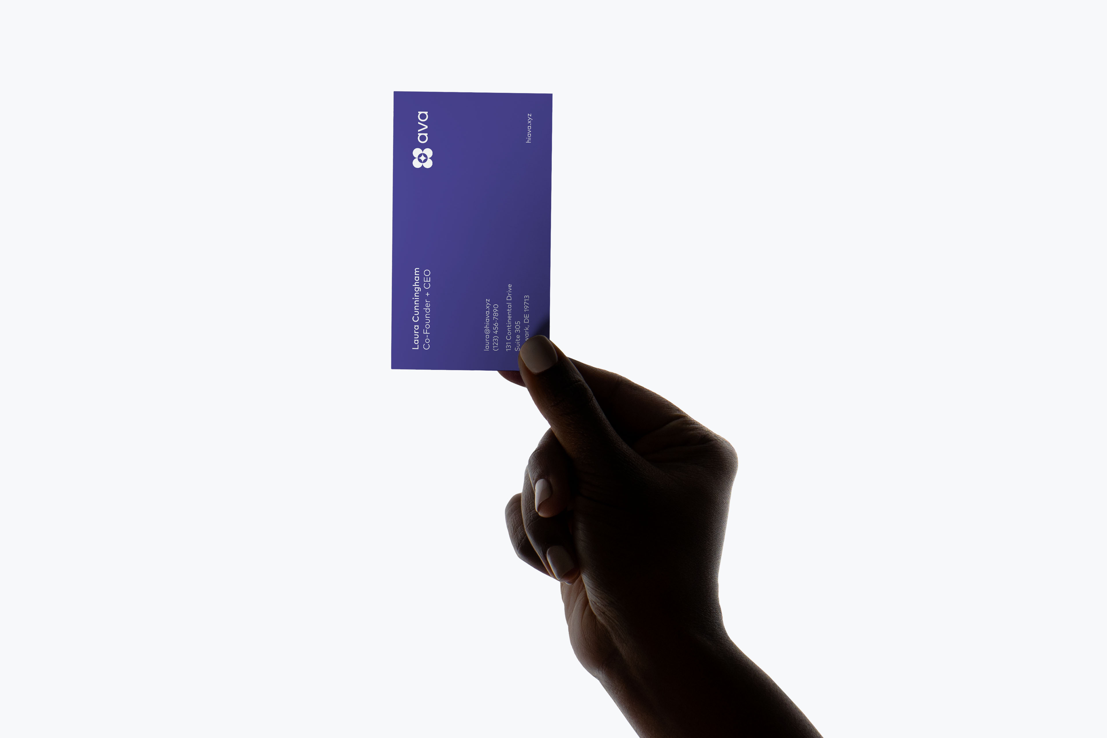
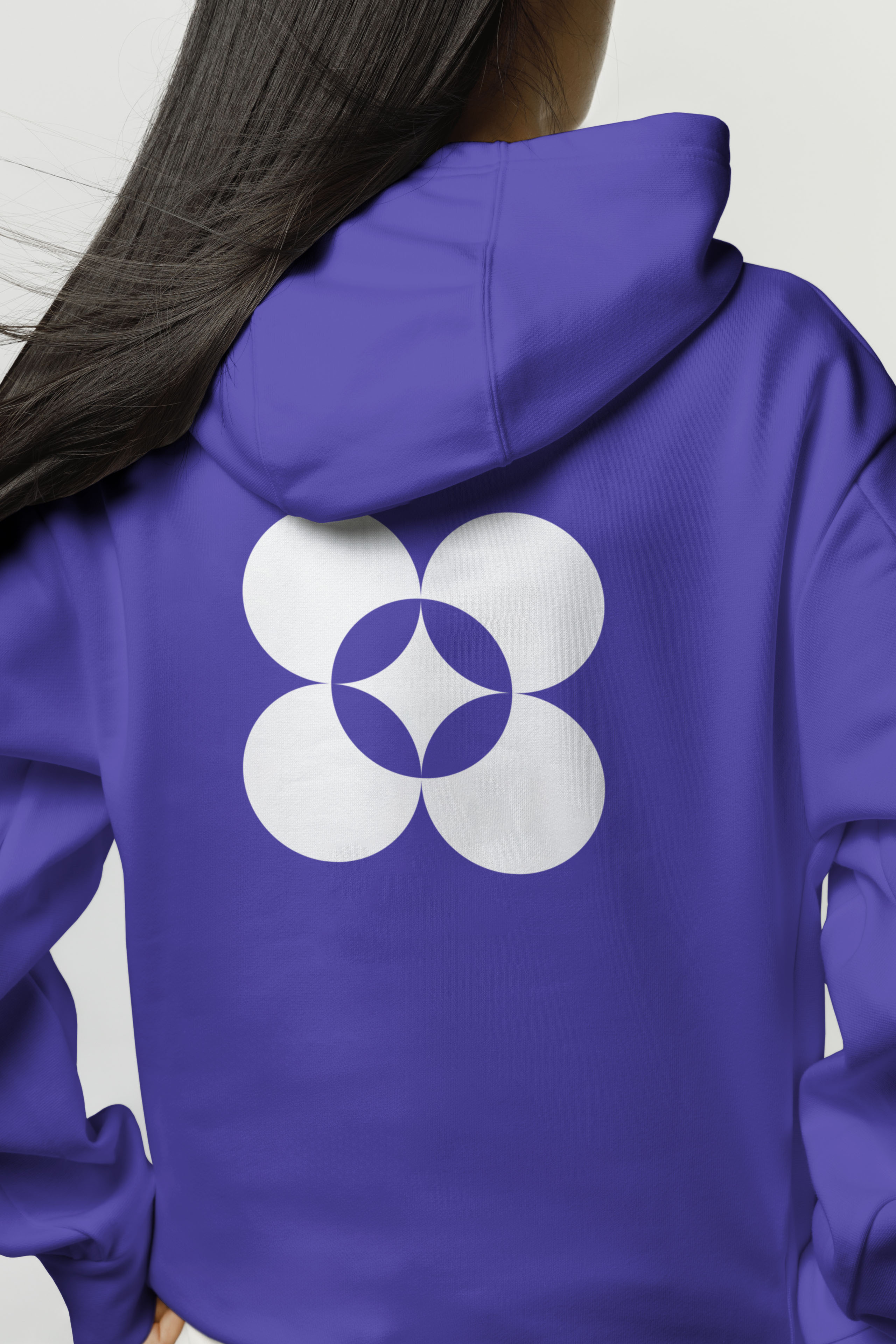
The direction is rooted in the ethos of quiet luxury — prioritizing timelessness over trend and sophistication that feels intentional without trying too hard. The identity retains its symbol while refining the wordmark — updated typography and rebalanced proportions producing letterforms that feel modern and brand-forward, introducing warmth and humanizing the technology without sacrificing refinement.
Color anchors that tone. A deep indigo grounds the system — confident and calm in equal measure — expanded by a supporting palette of peach, blue, yellow, pink, cream, and tan. The slightly muted tones balance reliability with warmth and sit comfortably at the intersection of technology and family life.
Typography is set in FF Mark by HVD Fonts — a modern geometric sans-serif that strikes the right balance between elevated and approachable. The choice of paid typography reflects the same logic as the broader identity: higher craft signals higher value, and the brand needed to reflect the actual quality of what Ava is building.
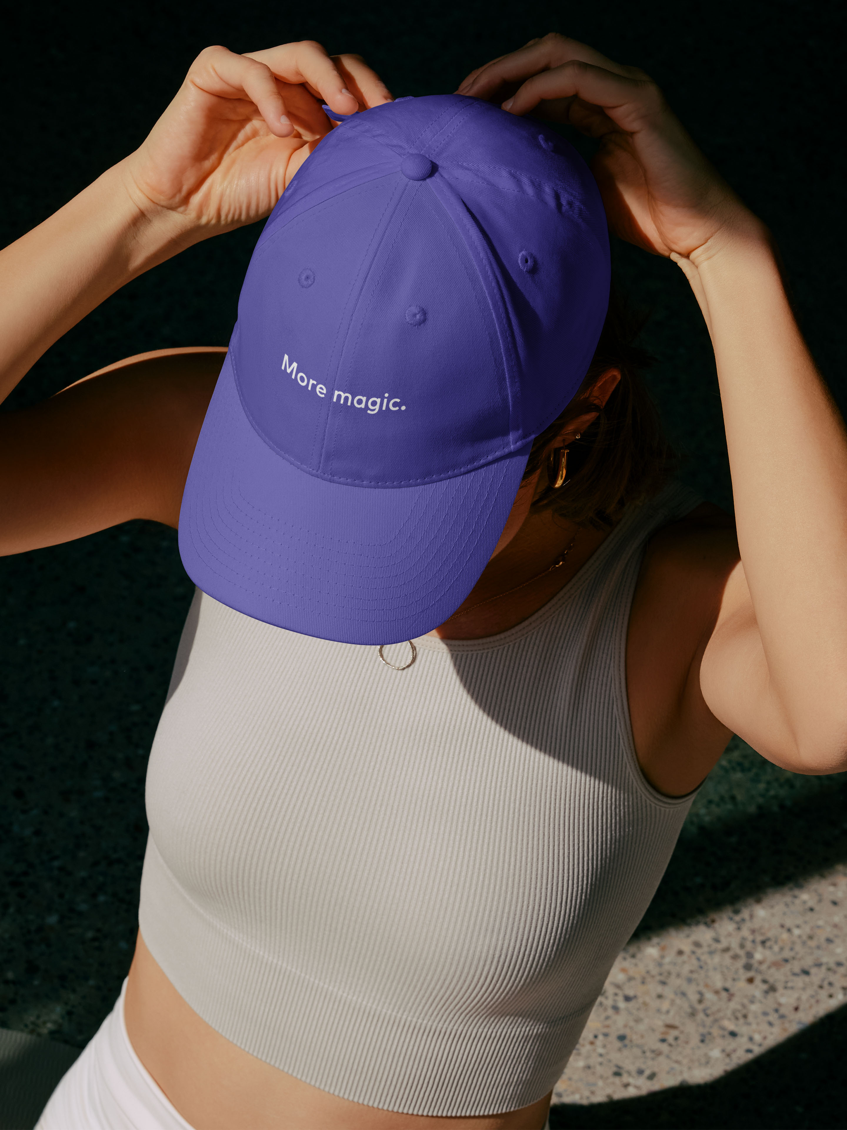
The identity extends into campaign work built around a clear, human truth. "For Every Type of Parent" speaks directly to the invisible labor of modern family life — the mental load, the emotional tracking, the endless logistics. Empathetic and validating in tone, the campaign positions Ava as a partner that gets it and gets it done. The work produced a slogan that captures the promise simply: More magic.