Building a brand for one of the most universal human experiences.
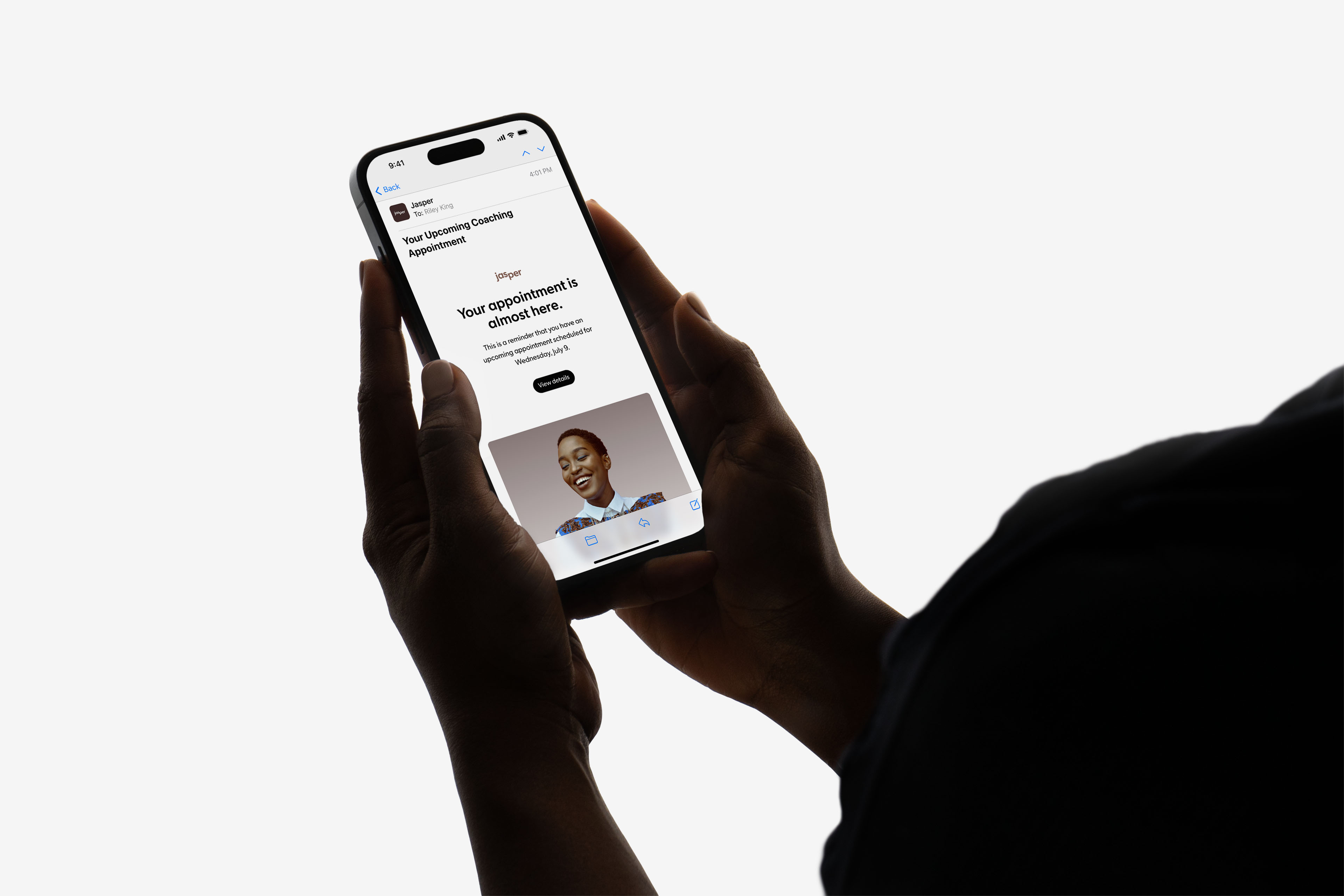
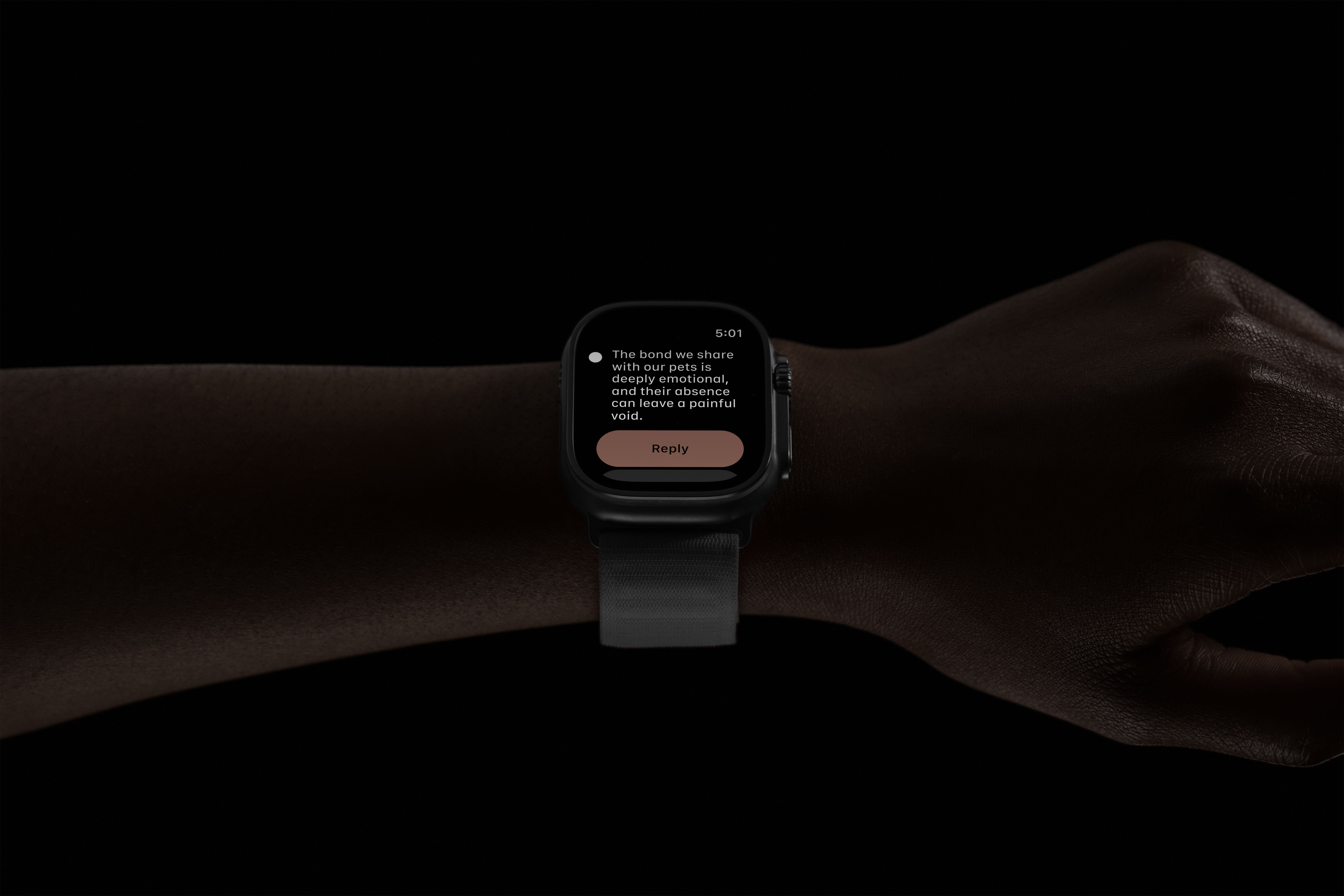
Jasper is a pet loss support platform combining expert grief coaches, live support groups, guided tools, and a moderated community. Petal partnered with Jasper to develop a cohesive visual identity, marketing website, and AI-powered platform — built around a single imperative: to meet grievers where they are and guide them through their journey.
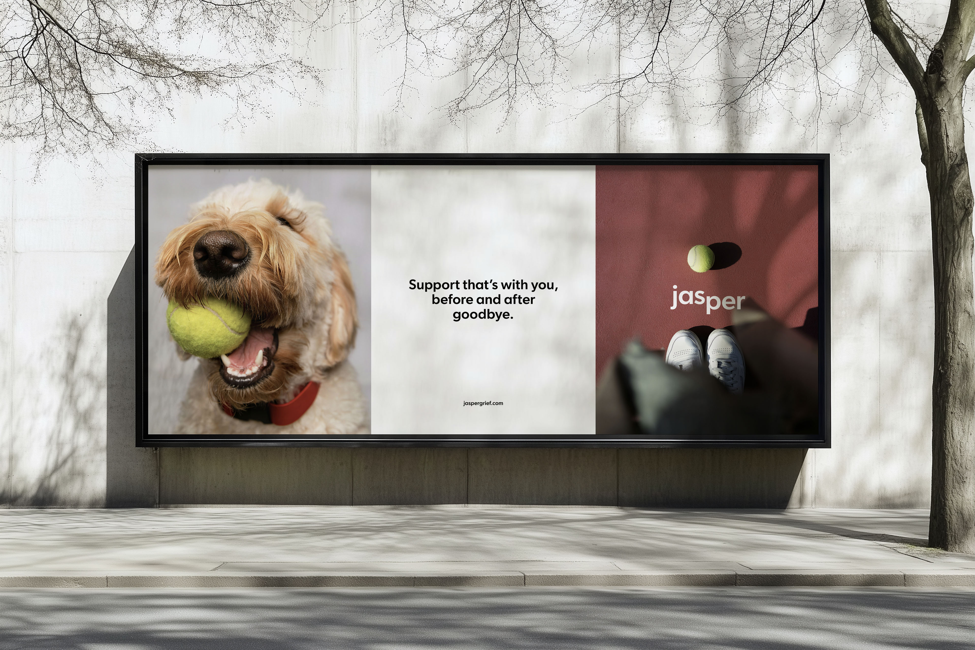
The central creative challenge was one of balance. Grief is heavy, and the brand needed to honor that weight without making it harder to carry. A clinical approach would push people away at exactly the moment they needed to feel welcomed. An overly soft one risked trivializing real loss. The identity had to hold both at once.
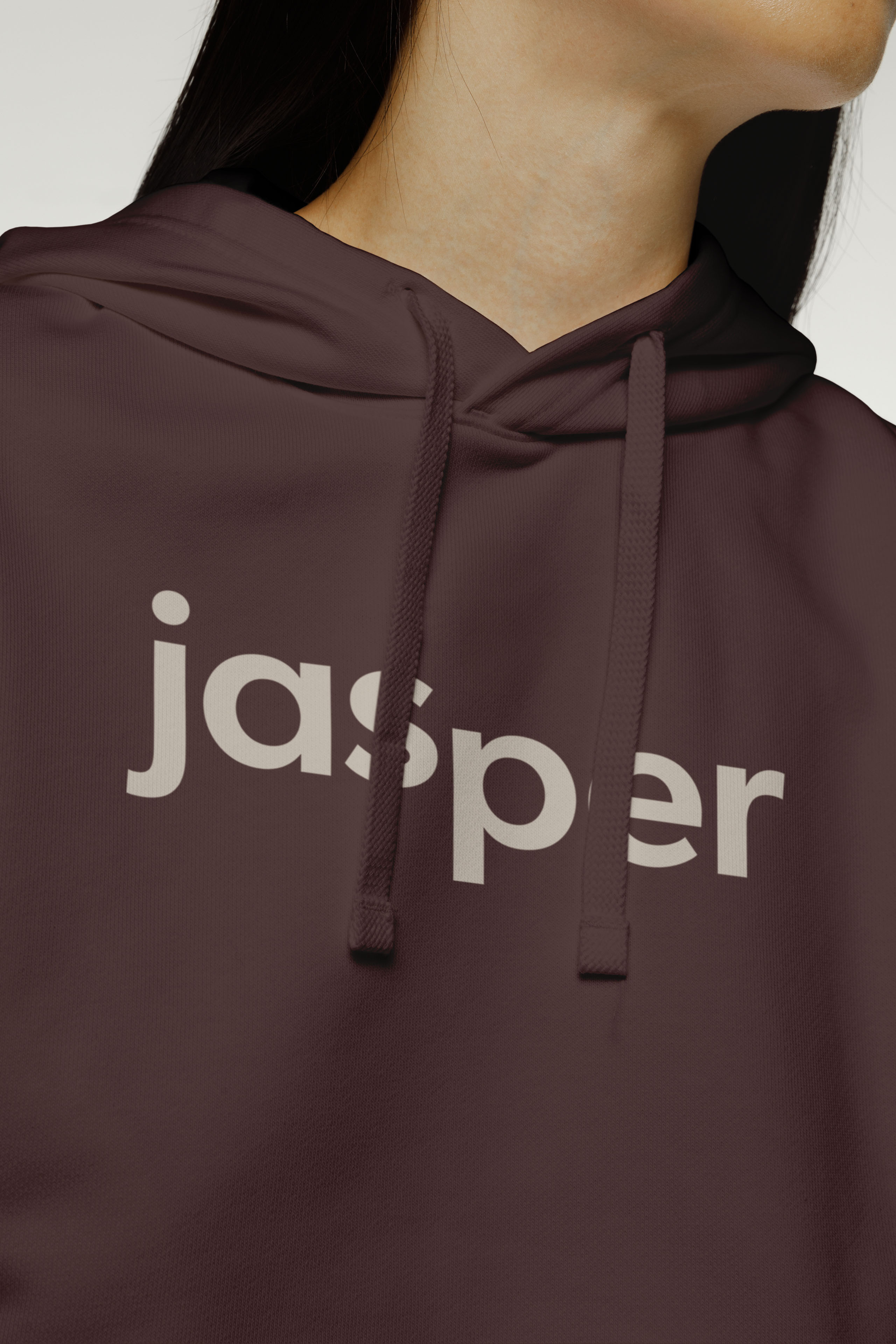
Color anchors the system in warmth and groundedness. Chocolate and Terracotta establish an earthy, human presence — the tones of comfort rather than distance. Marine Blue introduces trust and steadiness. Beige softens the palette, ensuring the system never feels heavy despite the weight of what it carries.
Typography reinforces the brand's character in a way that goes beyond aesthetics. The identity uses Gibson, a typeface designed by Canada Type in honor of a designer's lost friend. That origin — grief transformed into something lasting and useful — mirrors exactly what Jasper is trying to do.
The result is a brand that doesn't perform wellness or manufacture calm. It simply holds space — visually and verbally — for people navigating one of life's most quietly carried losses.