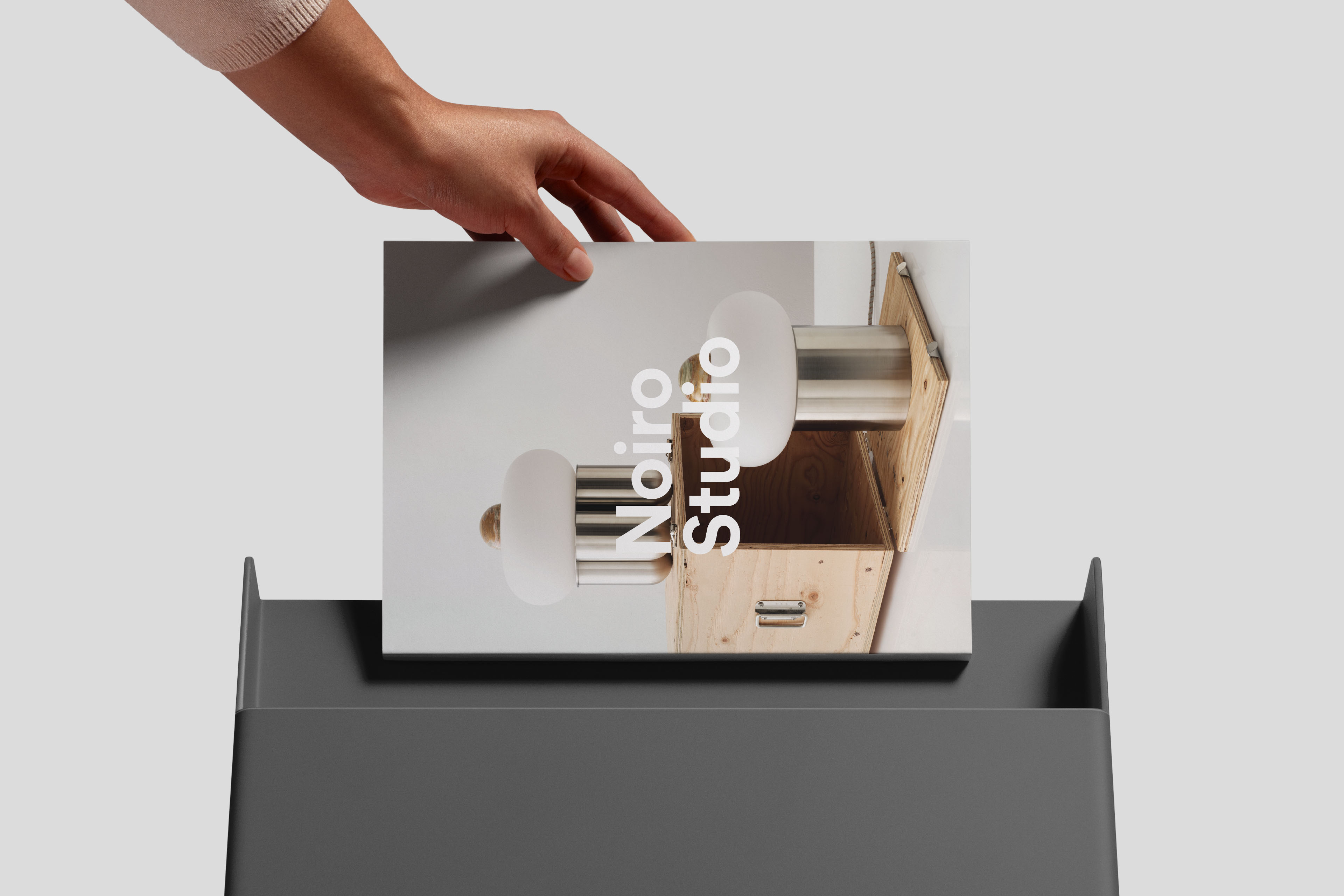
A refined identity for a studio crafting contemporary objects.
Noiro Studio is a New York–based studio creating handcrafted objects that sit at the intersection of architecture, interior design, and technology. Petal partnered with the studio's founder to develop a brand identity that reflects the character of its work — one that is modern, refined, and quietly playful.
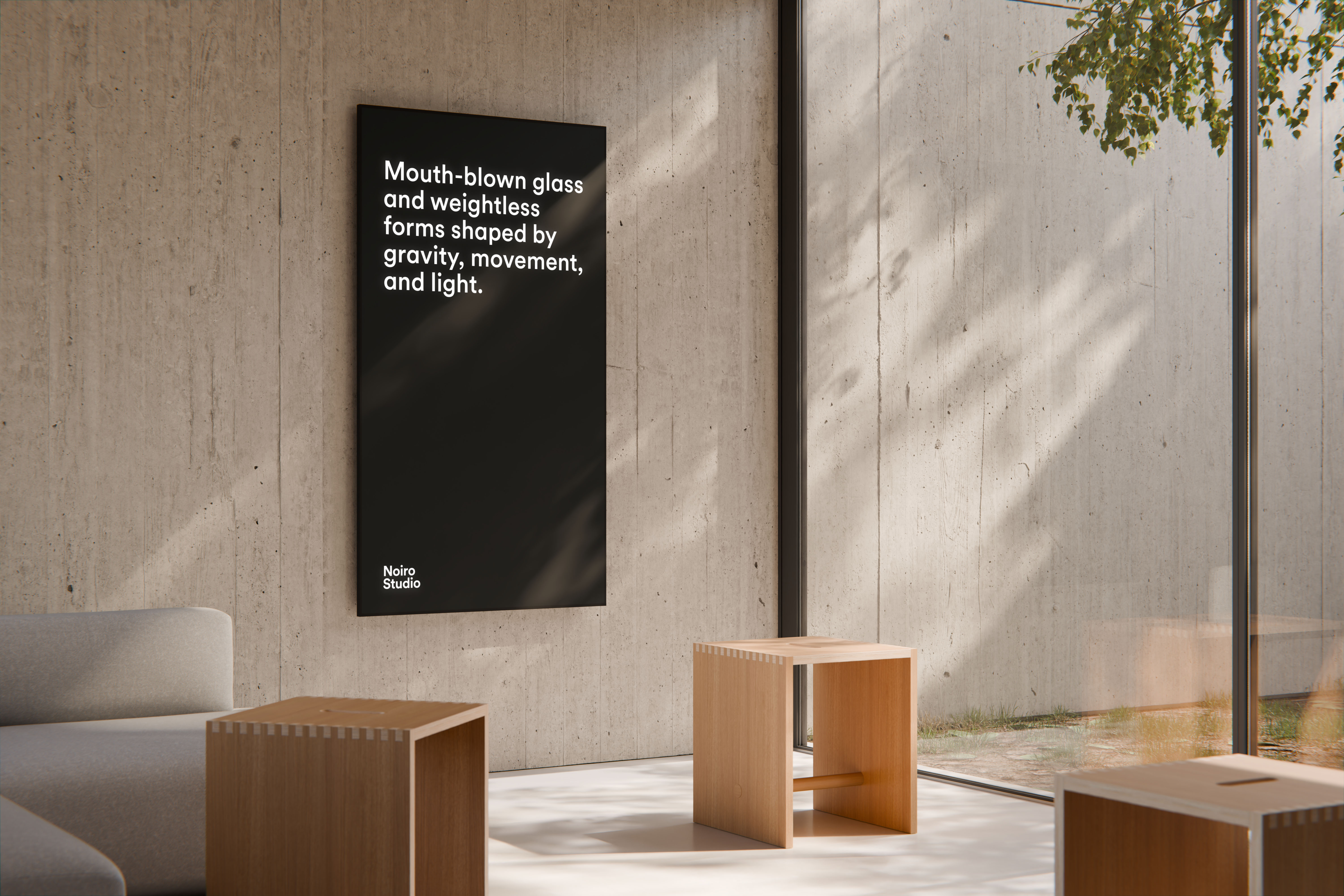
The identity is built around duality. Contrasts — light and dark, stillness and movement — express the balance between precision and experimentation that defines the studio's design philosophy. This wasn't a decorative choice. It was the most honest way to represent a practice where the rigor of architectural thinking meets the subtle irregularities of handcraft.
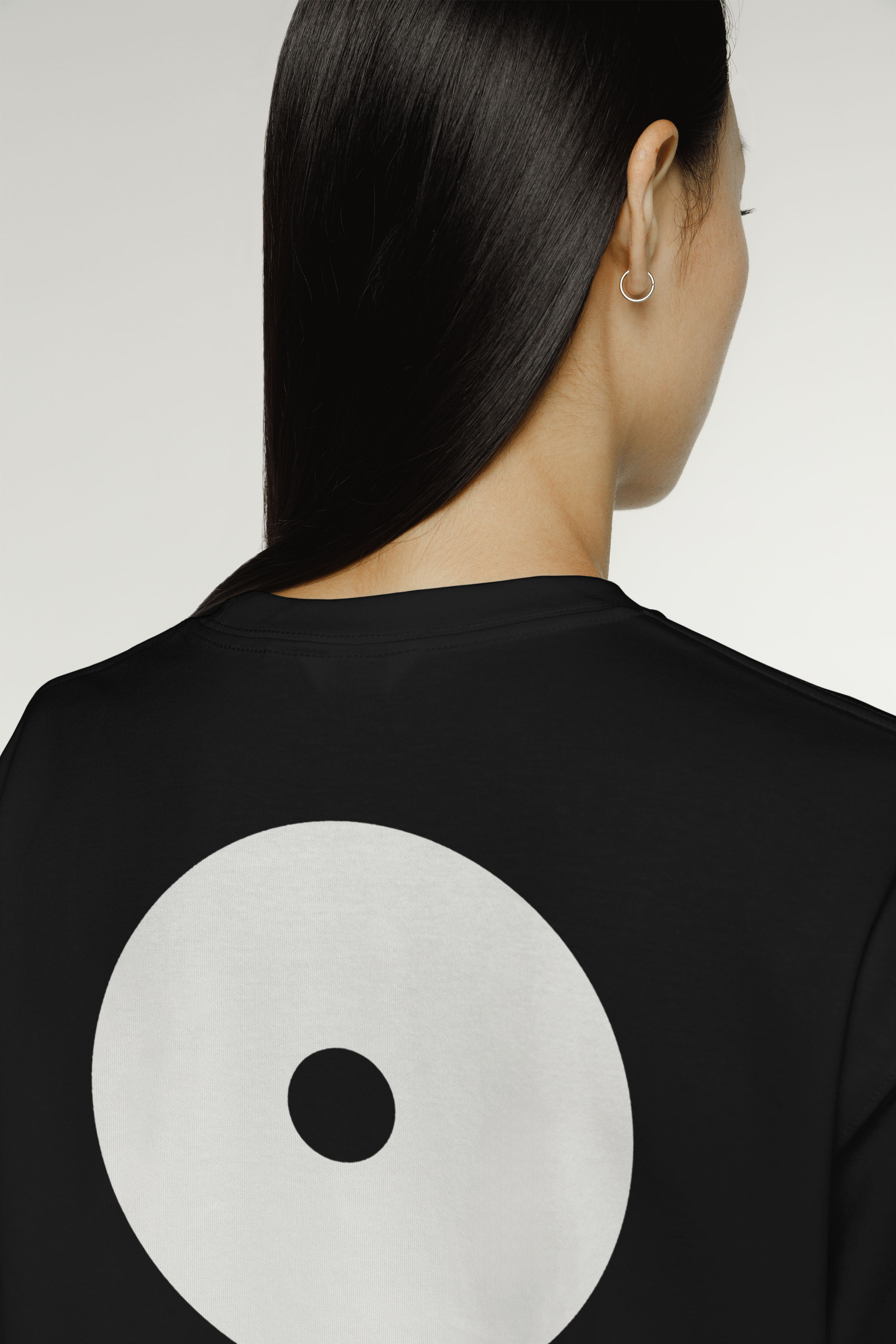
A modern yet approachable wordmark anchors the system, supporting the brand positioning of "handcrafted pieces for modern living." Its clean geometry establishes a flexible visual language that extends naturally across digital and physical touchpoints. Geometric forms underpin the identity throughout — referencing the studio's architectural sensibility while creating a sense of harmony and structure. Circular shapes play a recurring role: with no beginning or end, they suggest continuity and motion, echoing both the energy of the design process and the evolving life of handcrafted objects.
Geometric forms underpin the identity, referencing the studio’s architectural sensibility while creating a sense of harmony and structure. Circular shapes play a key role. With no beginning or end, they suggest continuity and motion and echo the energy of the design process and the evolving life of handcrafted objects.
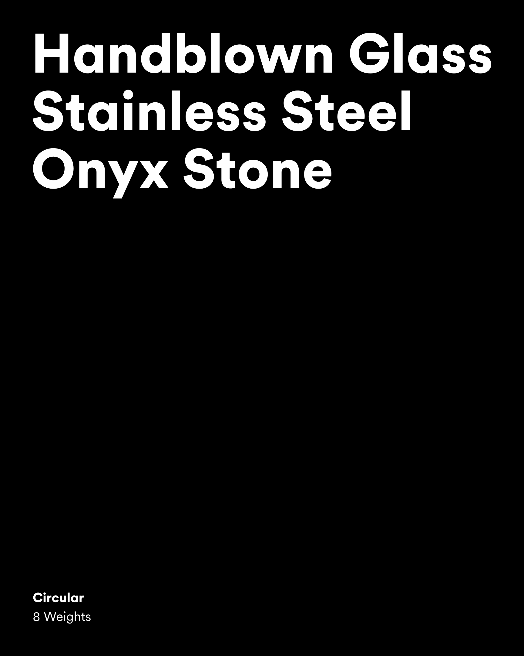
The typeface Circular by Lineto was chosen for its clarity, warmth, and geometric precision. Paired with a restrained achromatic palette, it reinforces the themes of contrast and balance that run through the entire brand — and produces an identity that is as considered as the objects it represents.